Rooster Teeth
Increase in annual subscription sign ups.
Summary
With all the interesting content, merchandise and events available on Roosterteeth.com, signing up and logging in is one of the last places in which a user should have to struggle. The users also do not know that they can sign up for a membership until they hit content that is locked behind a paywall.
In comparison, competing companies, on top of this method, also added “Try Free…” in the main navigation of the logged out view to advertise this service, which RT was missing based on the audit.
Task at Hand
Assess the current UX state for the sign up flow
Look into existing data
Restate the business goals
Make the sign up process faster
Give marketing the opportunity to collect marketing information without compromising user’s goals to watch video
UX Challenges
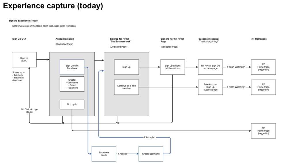
Figure 1: Part of a longer flow assessment.
To explain properly, we have to go back in time. When the website had first launched, it had come with two clearly defined pathways to subscribe, as well as the free model. As the business started to pivot and pull certain services from new customers, however, parts of the sign up experience started to “disappear”. What was left needed attention.
Short list of challenges.
It was time consuming due to confusing pathways
The upgraded subscription offering/messaging was outdated (high priority)
It lacked the “fun” experience that the brand is known for
Make it simple (which took many rounds of discussion across the company, sketching, and wireframing)
Make it easier to know about the free trial offer (for someone who isn’t already a superfan of the brand)
Figure 2: Data platform from Recurly. For privacy, have taken out data for proprietary reasons. However, the numbers show rank based on performance.
Data
In the subscription sign-up data, we found that users consistently chose to pay (in order of most sign ups):
1-month at a time
6-months at a time
1-yr at a time
Business Goals
Once we had the audit and data required, stakeholders and product were able to ask to question, what are the goals here?
Primary Goal: Increase user sign up
Secondary Goal: Increase users’ preference for the yearly (1-yr) membership
UX Solutions
To solve these issues, we landed on the following solutions:
Add new CTA
Add a “Try Free…” offering button right on the landing page. Place near the existing log in explicit button to draw the eye easily to free trial option.
Highlight best deal
During the selection process, (1.) default to the cheapest option on payment the day of purchase, but (2.) draw the eye to the “yearly” option as the best overall option, letting the user explicitly click. This way the user feels informed, not tricked.
Simplify payment
During the payment process, (1.) present a clean, short page for the user to select payment method, and then (2.) On Click, show the form required from that choice point.
Results
Employing the new recommendations, the product team was able to use intuitive and influential techniques to support user goals, but had we supported the two business goals?
Q1: Have more users signed up?
Yes, we saw a 17% increase in overall user sign ups. There were multiple factors:
improved, frictionless sign up design launched
RWBY new season releasing
heavy online marketing
Q2: Have we increased users upgrading with the yearly membership?
For 1 year memberships we saw a 15% increase in 1 year subs based on the changes.
Final Thoughts
“We accomplished the business goals from a data perspective, but we could have done a better job at denoting when the changes took place and making sure that we could test out the hypothesis via testing frameworks like Optimizely or Firebase.” - VP, Engineering
Translation:
Stagger the release of a new sign up flow with an A/B test x weeks ahead of the launch of a highly anticipated new season of a popular show to separate marketing effects on sign up data.
Testing on a smaller group before rolling out the new changes to everyone from the onset.
Establish a baseline before releasing tests. In the end, this was a stakeholder’s decision to “flip the switch” and outside of design control.
UX Deliverables
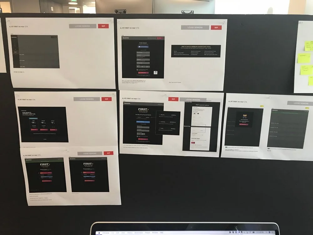
See some examples of the UX design process.


