Rooster Teeth
Increase in community engagement.
Summary
Roosterteeth.com arguably has the most opinionated, loving and rabid fans. As a cult-like, internet-only brand that started with a line of t-shirts and spanned to in-house production of shows, live events called RTX, and a host of internet stars, none of this would have been possible without the fans.
In research, about 10% of viewers are also active members of RT Community.
In 2018, the company dubbed 2018 The Year of Community. We were tasked to research the existing legacy experience, research competitive community-engaging experiences and create a brand new space for RT Community users.
Task at Hand
Assess the current UX state for Community
Look into existing data
State the business goals
Make it easier to post, respond and be alerted about updates
Create opportunities for marketing, both overt and organic
Help increase sales of merchandise
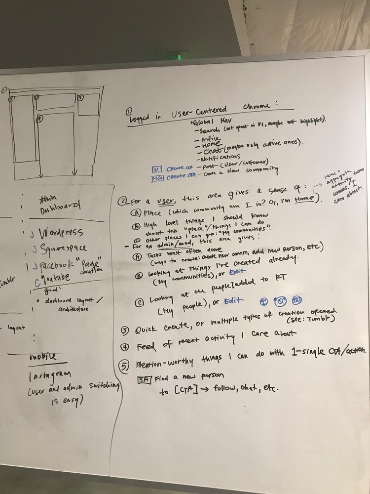
UX Challenges
Figure 1: Forum front page.
When the community first launched, it was created under the “forums” based paradigm, which has now aged out. As the business needed to make pivots, however, the backend became impossible to update. It needed an overhaul.
Short list of challenges.
Users expected to be able to do everything the legacy experience gave them
Users who were dissatisfied with the experience used competitors like Facebook and Instagram
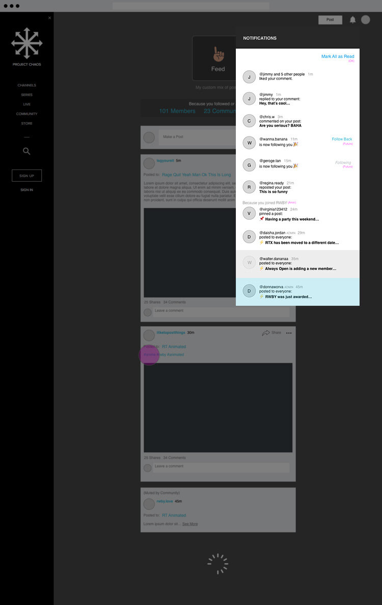
Product lacked notifications that modern users have come to expect as “the basics”
Make it “simple” (which took many rounds of discussion across the company, sketching, and wireframing)
Make it easier to know about the free trial offer (for someone who isn’t already a superfan of the brand)
Inability to port over old user “journal” entries to the new community experience
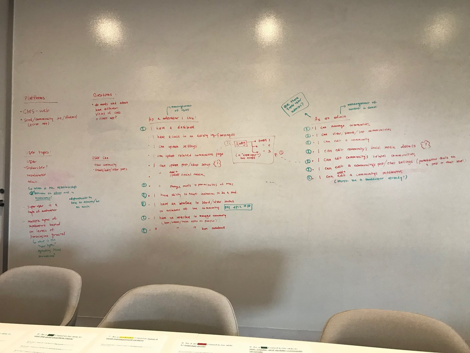
User Interviews
We flew to Texas to convene with a large group of moderators to help us contextualize the biggest painpoints and desires to keep in mind while reworking the community experience. Here are some quotes.
“Facebook is easier to use than RT Community. So, we plan events on Facebook, chat on Discord, and upload pictures of our hangout on Instagram.”
“I wish I knew when someone replied to my post, like Instagram.”
“I wish I could share video.”
“I wish mobile web were easier to navigate.”
“No spoilers! I can’t watch RWBY immediately because I have a job.”
Data Learnings
Engagement was highly pushed by talent and moderator participation
When a user created a new “forum” that had 3 or less users, there was likely a higher abandonment rate of the forum over the next 6 months (instead of the groups which had 100s of users)
Users who sign up with a free account tended to convert to a “super fan” model, defined as “purchase merchandise and/or become a subscribing member”
A significant amount of the userbase access mobile web over mobile app
Business Goals
Once we had the audit and data required, stakeholders and product were able to ask to question, what are the goals here?
Primary Goal: “Simpler” environment that millennial users have come to expect
Feed structure that’s easy to “just scroll through”
Secondary Goal: Throttle number of groups created (admin-based group creation, instead of leaving it to the user.)
Why: high abandonment rate of groups with very few users, but it was still costing engineering to keep the group updated
With smaller groups, more people can find each other and converse about their shared interest
More manageable on the engineering side
Less need for custom requests per form group moderator
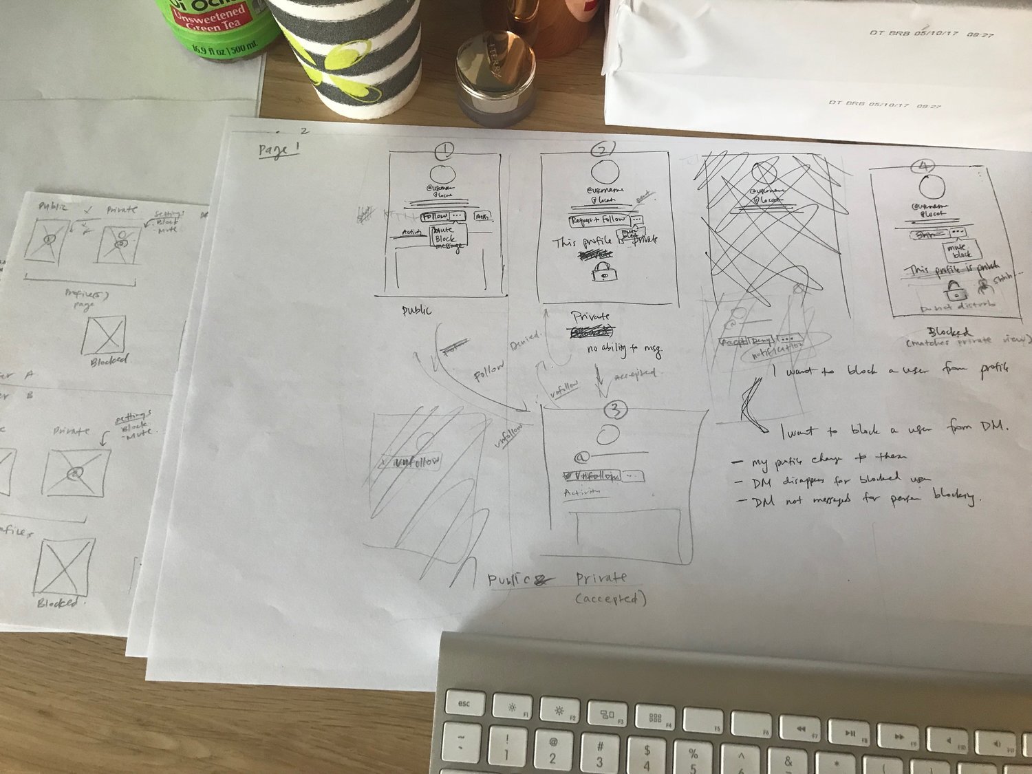
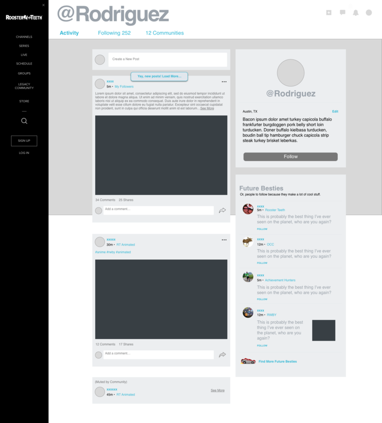
UX Solutions
To solve these issues, we landed on the following solutions:
Moderator Group Creation
Design a way for a moderator to create a new group, not a user, to. cut down on accidental duplicates.
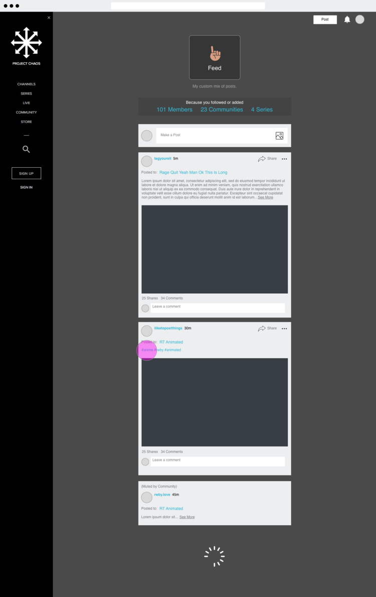
Social Media style design
Create a more modern, “social media”-style structure departing from the forums
Notifications
Robust set of abilities for a user to be notified to come back to the platform.
Suggestions (New)
Update “Suggestions” to be programmatic, saving on staffing costs.
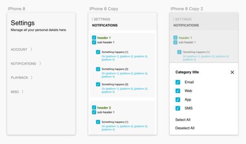
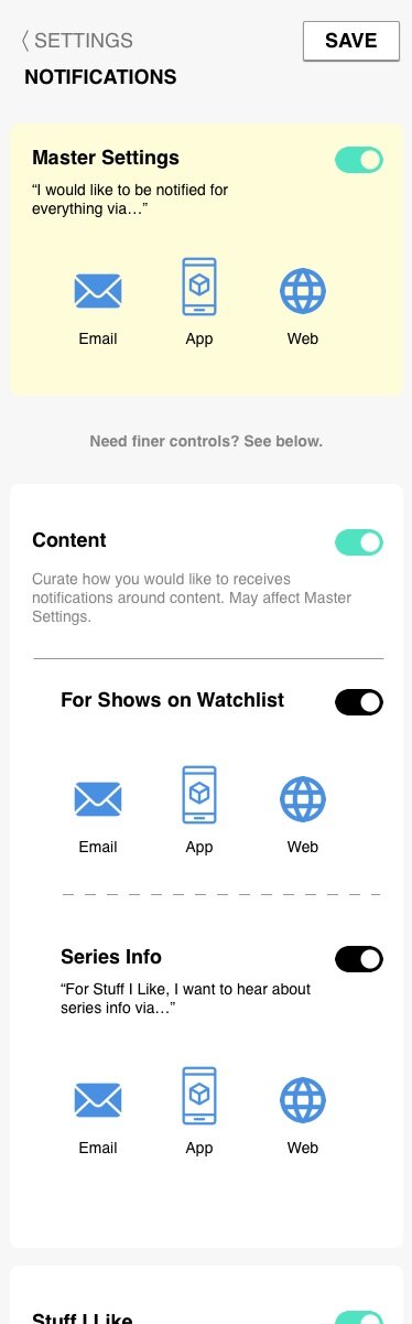
Settings (Update)
Giving users the ability to have individualized controls, allowing the business to push new messaging without being concerned about users bailing due to lack of control.
Mobile Friendly
Redesign need to work at all desktop- and mobile-web breakpoints
Results
Employing the new recommendations, we were able to meet the following goals:
higher engagement due to notifications, and larger numbers of people communing in single groups
increased revenue due to ability to post merchandise into the feed
lowered agitation of users from spoilers
increased time spent on platform to chat after watching shows and movies on the platform
Final Thoughts
This was a very interesting project - we learned so much about Reddit, Facebook, Twitter, Instagram, and Discord. We took business goals, and kept designs simple - even foregoing the ability for users to upload video to keep engineering costs low for the MVP. In the end, however, video upload from a UGC perspective is a huge lift, so it was the right call. They will add this in future improvements.
Overall, the users find the new system to be easy to use, and we had a high engagement on user input on what to add to the new platform, which was a positive sign for platform adoption.
To check out the “feel”, see the logged out view of Feed for free. It is free to create an account just to use the community features.
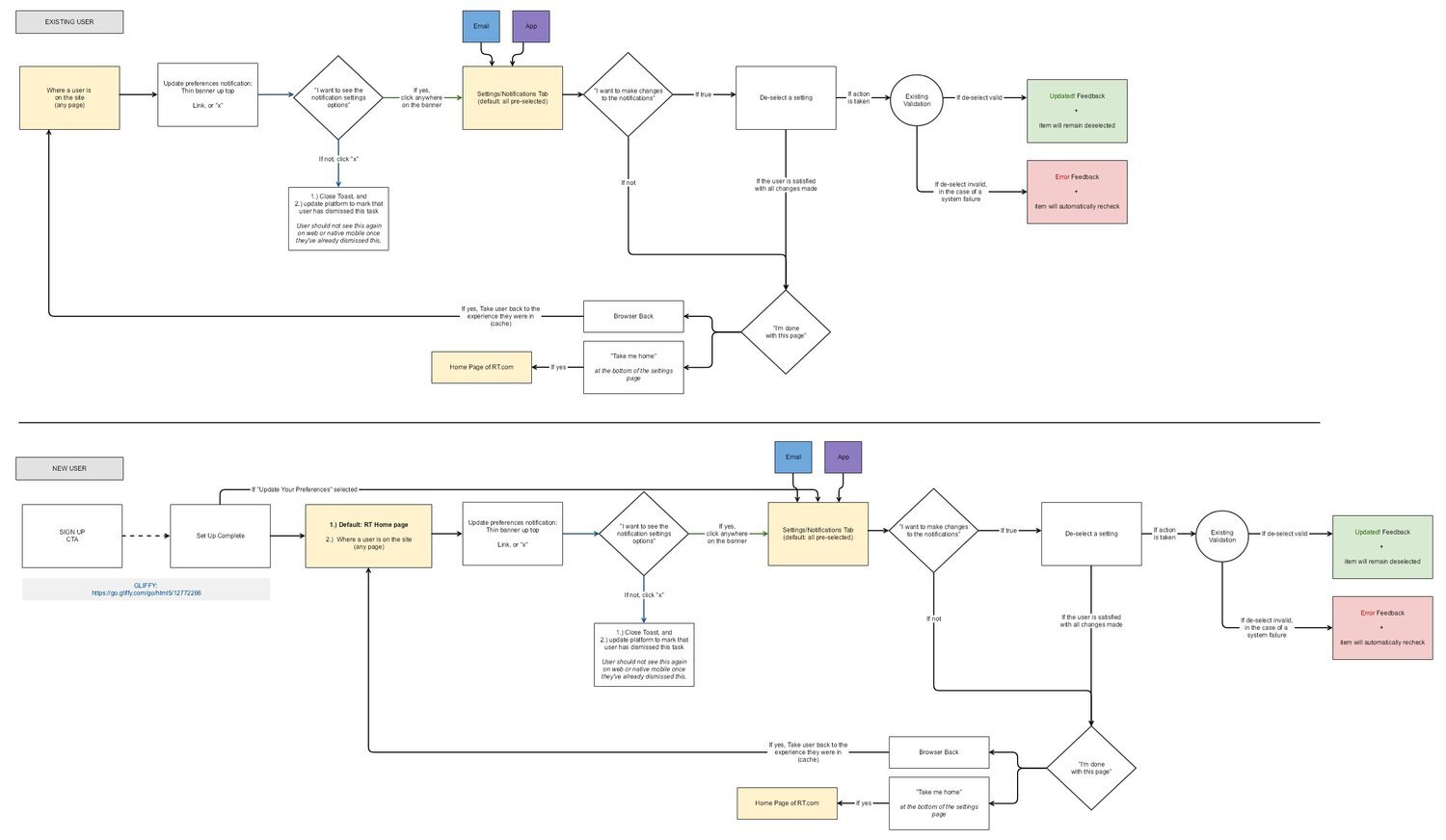
UX Deliverables
See some examples of the UX design process.